Template talk:Building cost
Why would you delete it when I'm obviously working on it? Napoleon (talk) 22:30, 20 February 2014 (EST)
I'm not even sure I like how this came out. Other opinions are welcome. Napoleon (talk) 22:43, 20 February 2014 (EST)
- Putting the building footprint in the resource table doesn't really make sense. Plus, the formatting doesn't work out; it makes it seem like the building footprint is related to or some quantity of whatever resource's row it's put on.
Well I have to agree, it's not really a building resource but the idea and execution are noted. I'm mainly focused on providing more information and images that are missing right now. I changed it before because things looked weird and I thought I messed something up.- illectrik
Ok, I apologize for lashing out. I think we should remove it from the chart. It just looked wierd sitting by itself. Maybe theres something else we can do with it to make it flow better with the page? Napoleon (talk) 23:51, 20 February 2014 (EST)
Perhaps there is a way to double or bold the line between the resource requirements and the layout to differentiate the two? Since space usage could be considered a "cost", I think it needs to be included somehow in this template.
Awesome job! Maybe try to make the Footprint go below the rest of the the resources since some are a little big. I'm working on HQ images for the buildings. - illectrik
How about the current way? Also if you type "~~~~", it signs it with your name and time so its easy to know when notes were written. We could change "Building Cost" to "Building Information" to better Describe the section. Napoleon (talk) 00:49, 21 February 2014 (EST)
Yeah, good idea. Illectrik (talk) 00:53, 21 February 2014 (EST)
Whew. That was a lot of work! Illectrik (talk)
Amazing progress though! Nice picture skills haha Napoleon (talk) 01:26, 21 February 2014 (EST)
We need a picture of Iron for the building cost table. Not sure where to get a large enough resolution one though. Napoleon (talk) 01:31, 21 February 2014 (EST)
I have my best man on it, Napoleon! Illectrik (talk) 01:37, 21 February 2014 (EST)
You think it's better to have the footprint before the cost table and not side by side? Napoleon (talk) 14:22, 21 February 2014 (EST)
Well my objective was to make it below the resources table because some images were quite large (quarry) and it just seemed better that way. I tried for a bit but it wouldn't take...I could however get it to work on the top. I don't think it's so bad. Opinions? Illectrik (talk) 16:28, 21 February 2014 (EST)
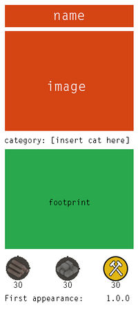
Hi there :) Personally I don't like the idea of the user having to scroll down half the page before seeing the building costs and/or the footprint. I'd suggest placing them both in the side bar? something like this? (sorry couldn't think of a better way of linking it than uploading it as an image.)


